Case Study:
Onsite App
Project Type
Capstone
My Role
UI/UX Designer
Timeline
12 weeks
Tools
Figma
Invision
Otter.ai


Project Goal
To create a digital solution to assist Ontario construction workers and tradespeople catalog and organize their safety certifications. ONsite's goal is to reduce the frustration and mental strain of manually collating and keeping track of entire worksites worth of certifications.
01 About
Let's meet
ONsite is an app designed to organize job site safety certifications and notify users when they are expiring.
It allows users to upload and keep track of when their certifications are close to expiring and where and when to find locations to renew them.
02 Methodology
The Double Diamond
Tradesmen and construction workers in Ontario are required by law to to have up to date safety and skill certifications in order to be allowed on the job site, to do specific jobs or to operate certain machinery.

Discover
03 Problem Space
What is the issue?
Tradesmen and construction workers in Ontario are required by law to to have up to date safety and skill certifications in order to be allowed on the job site, to do specific jobs or to operate certain machinery.
Currently certifications are issued in paper or pdf form, this format is not ideal to keep organized when employees work on multiple job sites or employers have to keep track of a large group.
ORGANIZATION
Employers have difficulty keeping track of employees certifications and their expiration dates. Currently there is no dedicated digital solution
FORMAT
Certifications are issued in a paper hard copy and pdf format. Making it difficult to collate and keep track manually.
AMOUNT
The average construction of a new house can have as many as 32 workers at any given time, each worker can easily have 10+ certifications each. The numbers are far greater for a building a new condominium.
04 Secondary Research
Investigating the problem space
Fines
The fine for an employer failing to make training and instruction records available to an inspector is $550. The Fines for contravening OHSA regulations can be as much as $100,000.
Safety
On construction sites in Ontario every year there is an average of 20 deaths and 300 serious injuries.
Of the 20 deaths per year, 10 of them are due to falling from heights which is one of the most commonly taught program certifications
Compliance
A recent survey reported by the CBC showed that nearly 20% of Ontario businesses do not offer safety and orientation programs that are legally required in most of the country.
05 Primary Research
User interviews
To understand the problem space better, I conducted interviews with 4 specialists in the trades/Construction Industry and I organized the data into pain points.

Owner/Operator
60 years old
Springwater, ON
Tradesman
Paul M.
Supervisor
34 years old
Guelph, ON
Construction worker
Mitch C.
Owner/Operator
34 years old
Springwater, ON
Tradesman
Jesse S.
Employee
33 years old
Angus, ON
Tradesman
Bill M.
From the interviews three main themes emerged
TIME & MONEY
Employers have difficulty keeping track of employees certifications and their expiration dates. Currently there is no dedicated digital solution
ORGANIZATION
Employers have difficulty keeping track of employees certifications and their expiration dates. Currently there is no dedicated digital solution
ENGAGEMENT
Employers have difficulty keeping track of employees certifications and their expiration dates. Currently there is no dedicated digital solution
Define
06 Persona & Experience Mapping
Uncovering the moment of oppurtunity
After funneling my interview data into insights and finding the the most consistent issues, I created my persona and the accompanying experience map based off of real pain points, goals and behaviours from my target users. These insights helped me to:
1.
Find pain points that can be assuaged with a digital solution
understand daily frustrations that encumber user productiveness
2.
empathize with a community I knew little about.
3.


07 How Might We Statement
Insights turned into oppurtunities
How might we...
Better organize safety certifications on Ontario work sites in order to improve workers welfare & regulatory compliance
08 Task Selection
Focus on a problem
Using my HMW statement and considering the needs of Colton, I created a set of 30 user stories and found 3 epics emerge to help me define the function of my product.
Core Value Proposition
To organize tradespeople/construction workers certifications and notify employers.employees when their certifications are expiring.
Core Epic
Organization
Core Epic: Organization

After identifying my main epic I created a digital way for how a user would interact with the product to complete this task
The task flow below shows an admin/supervisor checking to see if any of his employees submitted new certification for approval and then checking other employees to see if any of there certifications were near to expiring


Develop
09 Exploratory & Solution Sketches
Initial Ideation
Once I was clear on my task flow, I created a UI Inspiration board to find existing features, functions and design that would work well for my app. Using the inspiration board I started sketching out possible designs with pencil and paper. Here are my some of my exploratory sketches and some solution sketches of the app design ideation.
App Idea: An mobile app that uploads and catalogues users safety certifications making it simple and easy for Ontario construction workers and tradespeople to keep track of when their certifications are near to expiring and get automatically notified when they are.


10.a WireFrames Version 1
Moving Paper to Digital
Choosing solution sketches that were a best fit for my app, I started to build them into grayscale wireframes in figma.


10.b Testing plan Version 1
Seeking peer review
In this scenario you are a Construction supervisor on the jobsite and you want to check your app to see if any of your employees have submitted new certifications and if anyone else has any certifications expiring shortly and need to go for training to get them updated. It is important to have up-to-date credentials firstly, to make sure your job site is running safely and all employees are knowledgeable on safety standards and secondly to keep your documents organized in case a ministry of labour agent comes by to audit.
GOALS
Your goal is to keep your jobsite workplace compliant by ensuring all your employees and yourself have up to date certifications.
TASKS
-
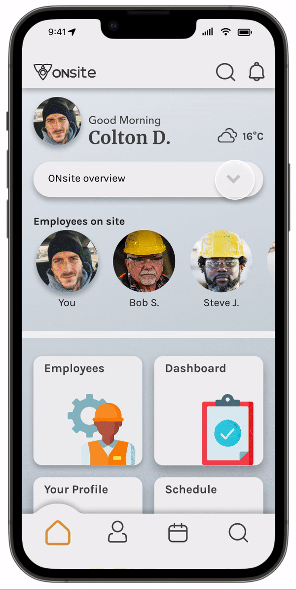
Task 1: Navigate to the Notifications page
-
Task 2: Navigate to bob’s profile from the notification
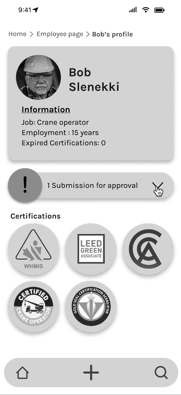
-
Task 3: Open Bob’s certification submission and approve the new documents and close the tab to complete the task
-
Task 4: Return to the Homescreen
-
Task 5: Open employees dashboard then find and click on any employee with a certification expiring in 3 months or less.
-
Task 6: Check for nearly expired certification and send a push notification to the employee
SUMMARY:
Number of users : 5
Tasks per user test: 6
Tools:
-
Zoom video call to conduct interview
-
Apple voice memo to record interview
-
Otter.ai to transcribe audio to text
Date: October 13 2022
After my first round of testing, I found that quite a few CTA's and navigations that were obvious to me where not to my users. Particularly the CTA to navigate to Bob's profile page from the notification modal, users needed more information than just an arrow icon. I organized this issue along with others I discovered during my user tests onto a prioritization matrix.
10.c Testing Results Version 1
Understanding problems


10.d Notable changes
Implementing feedback
"I can barely tell the difference between the background and the pop-up"
"At first I didn't know how to find Bob's profile"
Home Screen w/ notification modal
3/5 testers suggested the background behind the modal be darkened to create great contrast between them
4/5 testers recommended adding an outline or box to create different areas in the modal
4/5 testers suggested adding text to the Bob's Profile CTA to minimize user guest work on where it lead.

5/5 testers were confused by the pie charts purpose and why it was off center
4/5 testers recommended increasing the size of the employee cards so text could be spaced out better

Employee Dashboard
11.a Wireframes Version 2
Preparing for more user testing
After completing the changes suggested by users and finding solutions to issues that impeded usability I had my Version 2 Wireframes completed and ready to for another round of user testing.

11.b Testing plan Version 1
Seeking peer review
In this scenario you are a Construction supervisor on the jobsite and you want to check your app to see if any of your employees have submitted new certifications and if anyone else has any certifications expiring shortly and need to go for training to get them updated. It is important to have up-to-date credentials firstly, to make sure your job site is running safely and all employees are knowledgeable on safety standards and secondly to keep your documents organized in case a ministry of labour agent comes by to audit.
GOALS
Your goal is to keep your jobsite workplace compliant by ensuring all your employees and yourself have up to date certifications.
TASKS
-
Task 1: Navigate to the Notifications page
-
Task 2: Navigate to bob’s profile from the notification
-
Task 3: Open Bob’s certification submission and approve the new documents and close the tab to complete the task
-
Task 4: Return to the Homescreen
-
Task 5: Open employees dashboard then find and click on any employee with a certification expiring in 3 months or less.
-
Task 6: Check for nearly expired certification and send a push notification to the employee
SUMMARY:
Number of users : 5
Tasks per user test: 6
Tools:
-
Zoom video call to conduct interview
-
Apple voice memo to record interview
-
Otter.ai to transcribe audio to text
Date: October 13 2022
After my second round of testing, I found that my users were not using my pop out home button and discovered that none of them recognized it as a feature at all. Another suggestion put forward was to add a filter option for the employee dashboard so there was no need to physically scroll through every employee to find the ones with nearly expired certifications. This feedback along with others were prioritized and fixed.
11.c Testing Results Version 2
Understanding problems


11.d Notable changes
Implementing feedback
"I can't see the document I'm supposed to approve"
I didn't know there was a tab bar to get back to the homepage"
Bob's profile page
5/5 Testers suggested have the document submitted for approval should have a link that opens open it larger for clearer viewing.
03 clients
4/5 users recommended a filter option for the list of employees so that they could find nearly expired certifications easier and faster

Employee Dashboard
3/5 testers suggested making the notification icon smaller to be in line with typical icon size.
5/5 testers suggested making the tab bar more inline with standard options so there was no learning curve or confusion.

Home screen
Deliver
12a Branding
Creating the Identity
With the final flow of screens established, I started thinking about the visual identity of the brand before creating the high-fidelity prototype. Here is the list of adjectives the brand embodies:
-
Utilitarian
-
Organized
-
Convivial
-
Neat
-
Methodical
-
Welcoming
-
Accessible
-
Practical
With these adjectives in mind and words I brainstormed that are associated with my apps niche I created a list of potential names for the app that would trigger immediate response and recollection when read. With the assistance of user feedback I was able to narrow it down to the best candidate.


12.b Colour & Typography
Enhancing the experience
12.c Logo Development
Making it worth 1000 words


White Trillium Provincial Flower of Ontario

Geotag

Final Wordmark + Logo


Wordmark + Logo in black
Wordmark + Logo in white
App Icon
12.d Hi-Fi Prototype
Putting a bow on it
The video below illustrates the task flow of how a user would check the app for employee notifications, approve a certification submission and send a push notification to let another employee know they have a nearly expired certification and to get it renewed.
Please feel free to interact with the prototype by clicking the button below.
Marketing
13 Marketing
First point of contact
To create what might be the first point of contact with my users, I designed a Responsive Marketing Website.
Designing for Desktop first then moving to Mobile, I considered:
-
Branding and messaging.
-
The value proposition of my design: providing an all-in-one platform to assist Ontario construction and trades workers with organizing their many safety certifications
-
I wanted to make sure it carried the branding of the app and that it was functional and accessible.
My process of my deliverables for the Marketing site are
-
Research the current market.
-
Exploratory sketches.
-
Full-screen sketches.
-
Grayscale Wireframes.
-
Content Flow Diagram.
-
High-Fidelity Prototypes. (We must consider Desktop, Mobile, Tablets & animations in our responsive design).
During the process I requested the help of fellow designers to give their input and how the site could be improved and if there were any areas I was missing.
13.a Sketching
Pencil to paper


13.b Lo-fi Wireframes
Distilling the design


13.c Content flow Diagram
Sectioning and highlighting
13.d H-Fi Wireframes
Finalizing the concept


13.e Hi-FI Prototype
Going live


13.f Expanding Across Platforms
Trying it out on tablets

For a larger yet still portable version of my mobile app I thought that tablet would be an appropriate format. All the capabilities of a desktop but with the on the go weight and user interface of a smart phone.
Future Thinking
14 Key Learnings
Understanding Lessons
K.I.S.S.
As flashy and eye-catching as complicated UI design can be it is best to work on fundamentals first and ideate a clear and cohesive project. When the pieces are laid and I've created a functioning and user focused design then it is time to circle back and add a little personality.
15 Next Steps
The Journey doesn't end
EXPAND
Add more functions and options to ONsite. Find ways that it can help integrate into daily construction site life and solve other problems
FEEDBACK
Ego and a lack of humility have no place in good user focused design. Peer review and feedback are some of the best creative tools in your design work belt.
IMPROVE
Continue to integrate constructive feedback, not only on the usability of the app but also to ideate new functions
